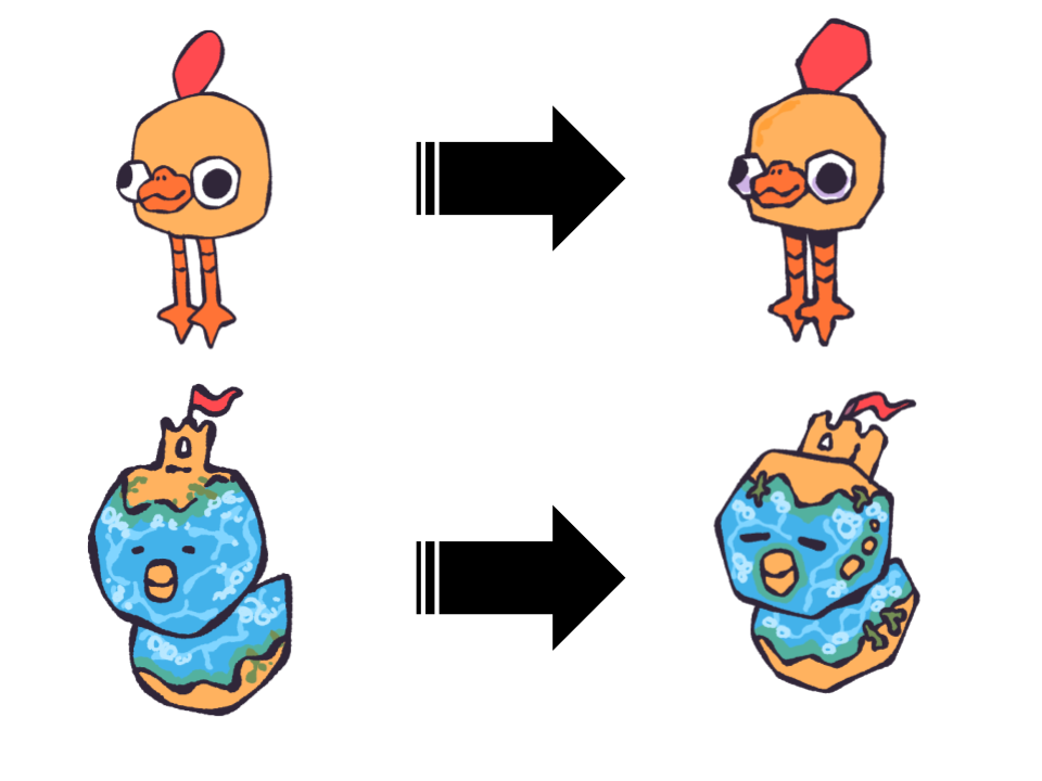
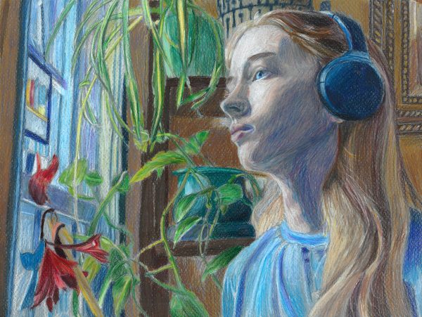
When looking at pieces of artwork, the first thing I notice are the colors the artist used. I see the harmony or chaos of the color palette and how they chose to send a message or establish a focal point with it. Artists can tell a separate story just with the colors they use.
When there is minimal color, such as black and white, it is a little bit different. Instead of seeing how the colors are interacting and supporting each other, black and white makes you focus purely on the subject of the work. It makes
you appreciate the values, shapes, and details hidden inside as they are enhanced incredibly between the contrast of black and white.
There are things to appreciate on both ends, and things to find difficult. Personally, I really enjoy using both color and black and white mediums.
When I use color, I have a lot of room for creativity to express myself. I can play with colors more than I realize I can, and depending on what colors I use I can convey a different message. Each color is correlated with emotion: red with anger, blue with sadness, yellow is sometimes used to convey happiness, and more. With black and white, it’s such a small range of color that you can not expect the audience to pick up an emotion just from that.
When it comes down to actually making an art piece with color, I love being able to look at an image and just see what is there. Very rarely is a color in an image just one solid color. For example, when it comes to skin, specifically pale and or white skin, you can find blue, green, yellow, red, purple, and sometimes orange. When you start adding some of these colors, it makes the image lifelike. Color can help make an image look real and raw, and I really enjoy seeing that happen on paper for me.
On the other hand, black and white is really fun too. I can create form and focus solely on the value of what I am making and sometimes that feels like a breath of fresh air. As defined by Kristin Farr in the New York Times’s Analyzing the Elements of Art: Four Ways to Think About Value, “Value defines how light or dark a given color or hue can be. Values are best understood when visualized as a scale or gradient, from dark to light.” If I’m doing photo realism, It can be stressful to try and see all the color variations that are needed to bring life to an image. With black and white, all I have to focus on is making sure I add enough dimension to make an
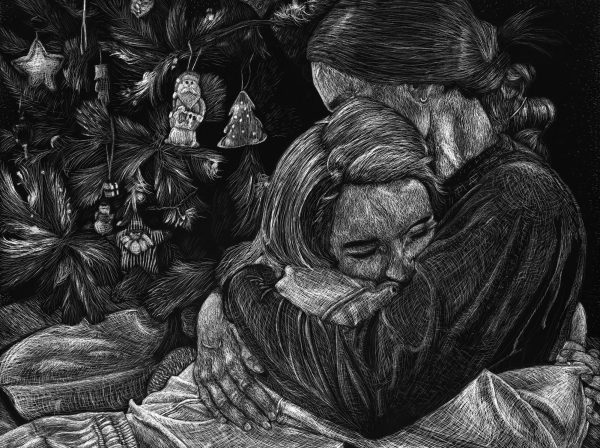
image 3D, or have form.
I also feel that I can get more visual detail with it. Not to say that detail is not a focus in color art pieces, but in my personal experience my main focus is to correctly color match or find the right color palette. Not getting every strand of hair, vein, groove in a knuckle or any of the smaller details that may get lost when color is applied. I feel that those smaller details come a bit easier with black and white because there is less stress about getting the right color in to shade it correctly; it is just being able to go in and make it lighter or darker.
Originally I only really enjoyed doing black and white pieces of work. The thought of having to do color felt very overwhelming to me because I believed that it would be difficult to try and find and properly translate every single color I could see. Over time though, I have grown to appreciate the beauty and complexity that comes with color and now I have a lot of fun with it. I can’t say that I have a specific preference as what I prefer changes depending on what piece of artwork I am creating, but I have grown fond of both and can find enjoyment in them.

