











Logos are an art form that often goes unappreciated. Done right, they are able to sear themselves into the minds of consumers to the point where one cannot picture the brand without its iconography. Nike’s “swoosh” or McDonald’s golden arches are but a few of the multitude of famous logos we see in our daily lives. However, in our increasingly corporate world, companies are in a race towards the bottom. Logos are being designed and redesigned with an apparent lack of heart and soul. There is no clearer form of this than the oversimplification trend.
“I don’t really understand the purpose of companies simplifying their logos to the point where it becomes a collage of colors with no attachment to the original design,” said senior Hudson Schmieder. “I think in the process they lose the meaning that the original logo had.”
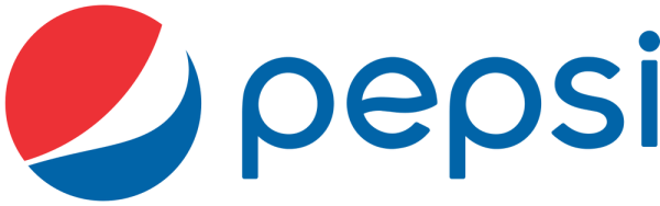
The minimalism craze has been going on for quite some time now, most notably with Pepsi’s controversial logo change in 2008. What used to be a design oozing with charm and sleekness became flat and boring. Other companies followed suit, and soon most brands blended into one homogenous nothingburger. Straight text, lack of colors, dull fonts. Google, Spotify, and Microsoft are key examples of this. Everything is overly neat with no personality. The death of the logo was here, and individuality was a thing of the past.

“The oversimplification of logos is a detriment to logo design,” said Masco alum and former Graphic Design student Marco Russo. “Not only does it assume consumers are not able to comprehend current logos, but it makes designs uninteresting and boring.”
The bigger question is “why?” The answer lies in the technological landscape in which we live. Companies compete for space on your screen, which leads to their symbols being designed as app icons first and logos second. This leads to a complete lack of nuance in design compared to decades past. In this increasingly digital world, logos are made in deference to a screen, and not a sign or magazine advertisement, leading to the minimalism craze that companies like Pringles and Dunkin’ Donuts can’t get enough of.
“It all boils down to companies abandoning their personality in favor of cheaper printing and less effort,” said Masconomet poster designer senior James Payne. “It’s not the future, it’s just lazy.”
So, what can companies do to evoke some life back into their logos? An option is to look back on the past and tweak previous logos to fit the modern landscape. Though the golden age of logos has long since passed, some designs are too good to change. Ironically enough, Pepsi returned to a logo reminiscent of their 60s iconography in 2023. Abstraction can be a good thing, but companies need to harness it in a way that keeps their logos visually appealing.